MENU

The Back Story

DishTV is a pioneer in digital entertainment and Asia’s largest direct to home entertainment company. As part of the Zee Network Enterprise, it comes from a corporate family who has designed their business and achieved success through innovative offerings and revolutionary features. It brought quality home television experience to the masses just when consumers were looking to access premium quality digital entertainment.

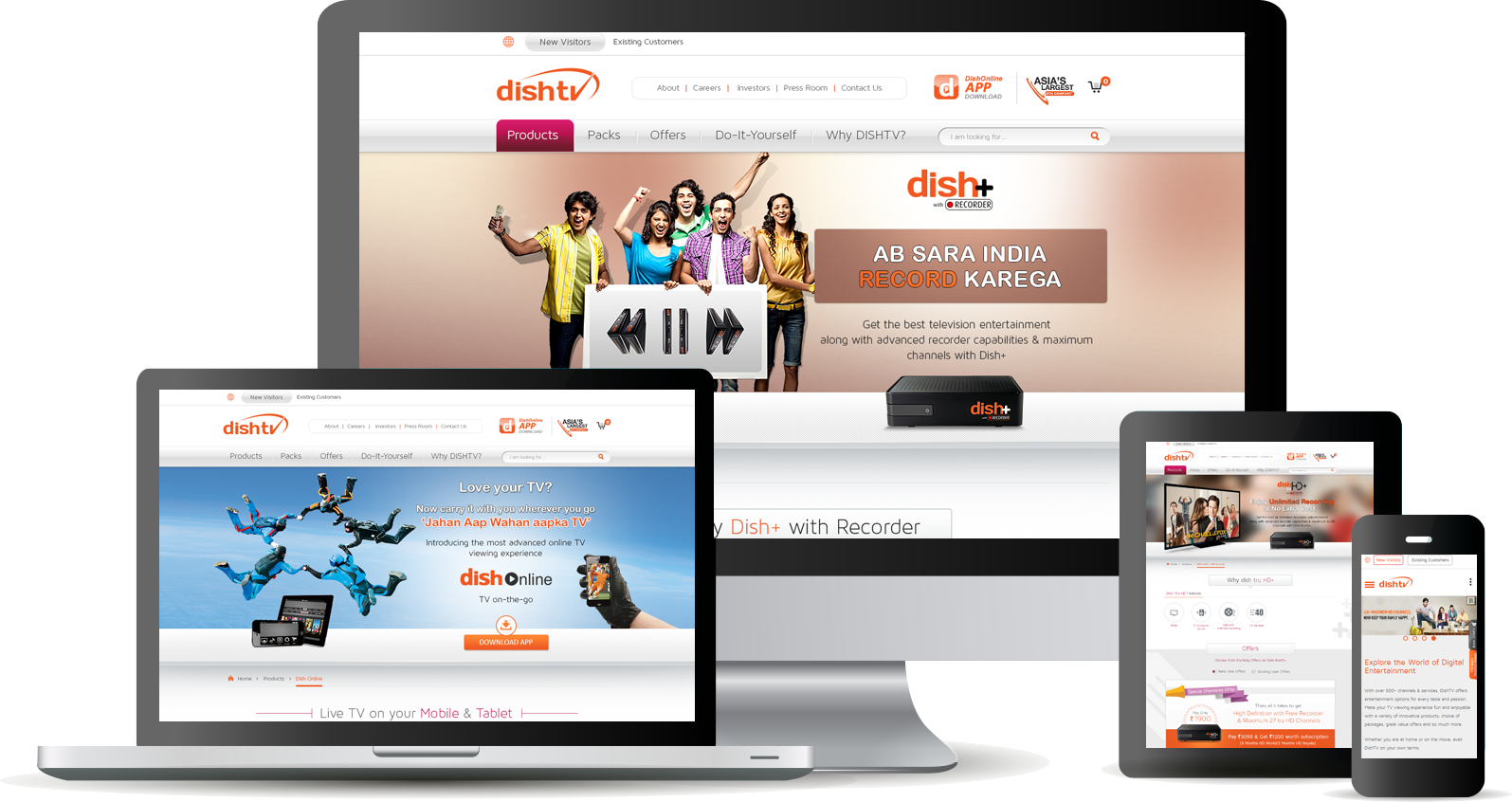
DishTV was looking for a partner who could understand their primal requirements and drive online engagement through a user friendly website. They essentially wanted a makeover that would position them in tandem to their offline image, and as a company that caters to the whole spectrum of audience there is in the industry, the challenge was to create such a portal that can be easily managed by the whole management team at DishTV. Such measures were important to avoid dead links on the page.

This was a multi-agency pitch wherein a differential approach for marrying both the offline and online initiatives gave us an edge over the other digital media players. We began this project on a note of discovery- by unearthing the entertainment needs of the users and mostly the ‘passion’ behind watching a particular program, channel or a show. The insight gathered was that there are different users with different entertainment needs who require a different content marketing strategy.

What was Proposed at the Stage of the Pitch?

Creating a uniform platform online that helps DishTV engage more from an entertainment standpoint than being focused on the product itself. This allowed DishTV to leverage the potential of reaching its audience through entertainment enriched content such as movies, sports, music, regional entertainment amongst others.

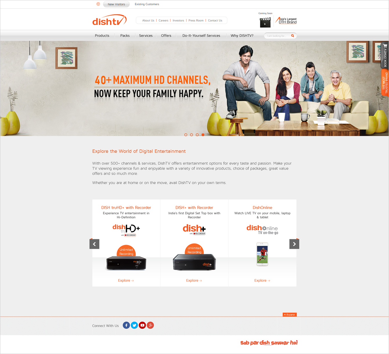
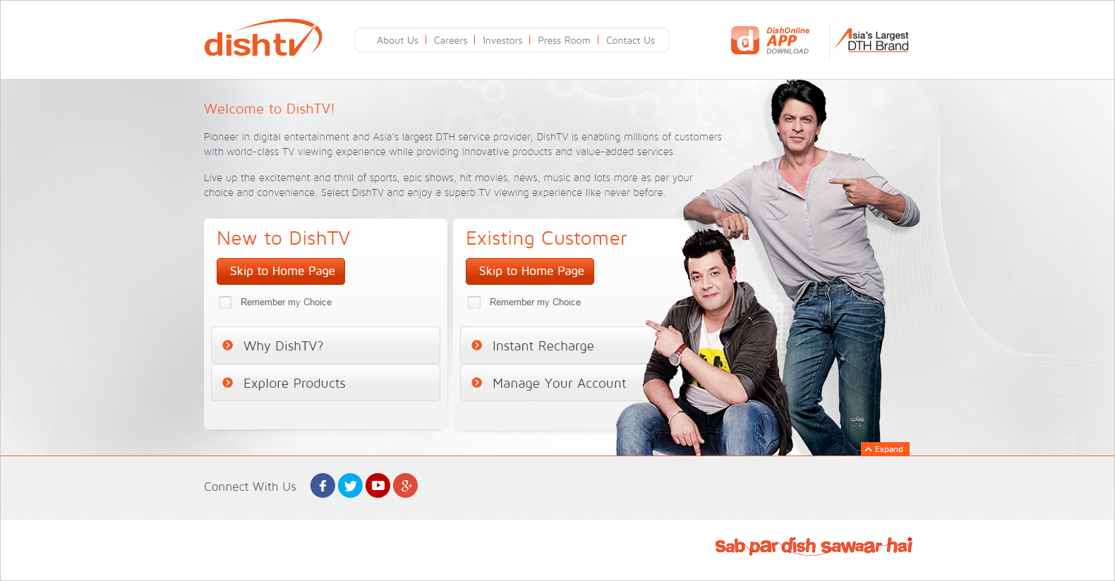
We wanted to make sure we move away from product-oriented approach to a personalized content marketing approach. The entire UX strategy was based on this insight and we crafted two parallel journeys, one each for existing DishTV customers and prospective customers. Storytelling was thought through based on mind sets and needs within both these identified subsets of users with key call-to-actions featured upfront along with an option to navigate to two separate homepages each of them linked to seamless journeys tailored for the two distinct types of stakeholders.

The Start

The Meta-Data Appropriation

We began by analyzing the data that could be made useful in creating a web presence that would give relevance to the entertainment needs of different stakeholders. Lucky for us, DishTV had a lot of data that could be re-designed and appropriated into a seamless story of their brand and all that it stands for.

A Better Way Forward

The next step forward was to identify the audience that the website was going to provide for. We understood that a person associated emotionally when it came to his or her entertainment needs, however, when it came to using those services, it was a much more rational activity. So, we realized that all customers can never be assumed to have the same expectations from their Direct to Home television provider. On the basis of the needs and requirements, we understood that a two-pronged journey for existing customers of DishTV and a new customer of DishTV was essential in creating a more seamless and personalized experience.

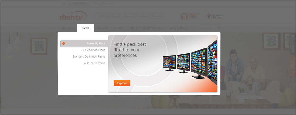
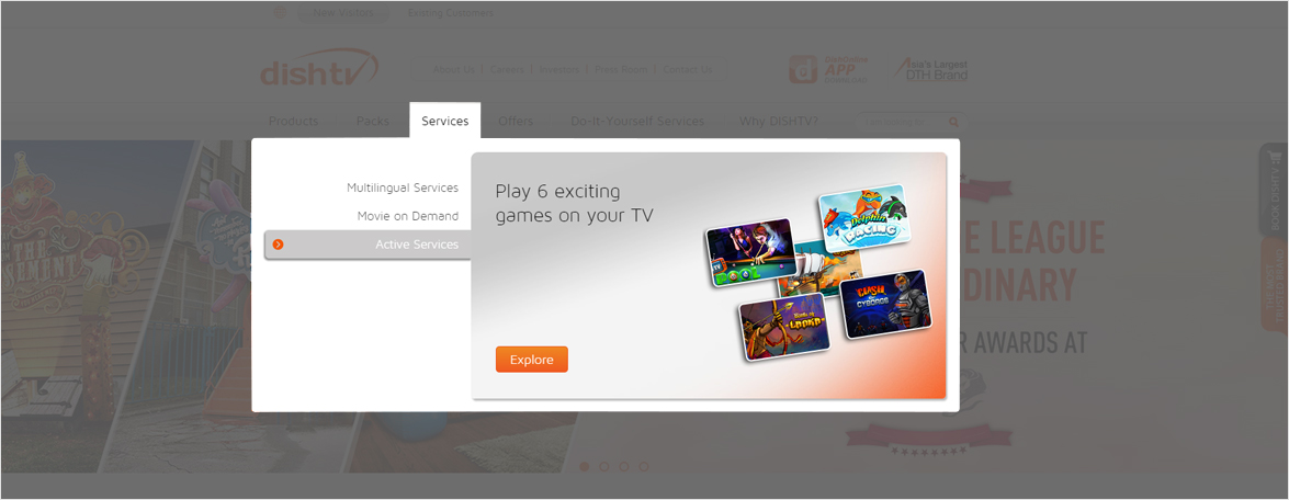
Active Service-hidden Presence

DishTV enjoys an impeccable reputation offline; the reasons being that it provides extensive customer service, value added offerings, packs of innovative products and of course the association with the Zee Group. But the online presence had to reflect the brilliance of such existing services through a design that made it possible to navigate seamlessly through these all-embracing services.

A Planned ‘Product’ Search Engine

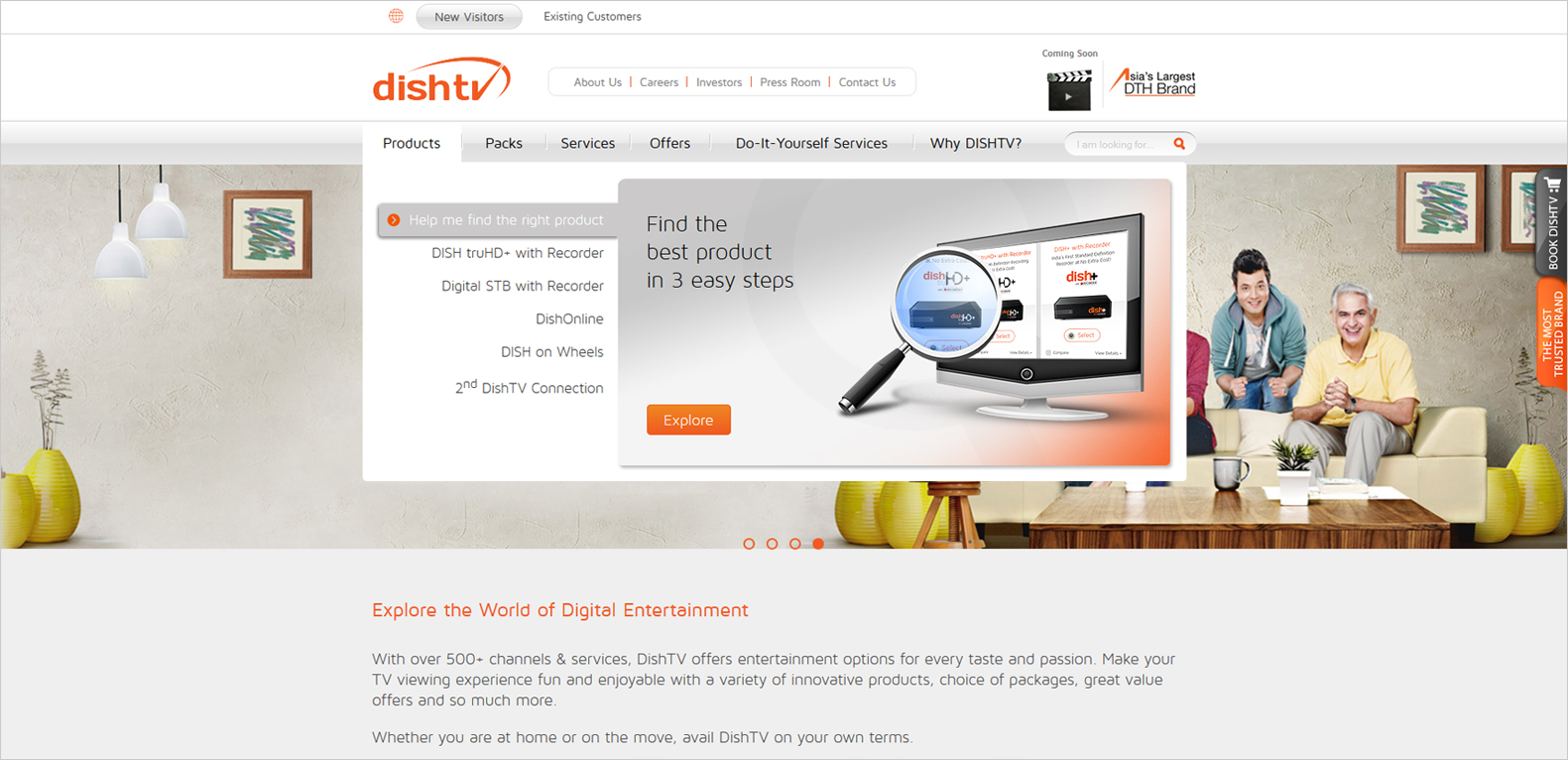
We built in features to help enhance user engagement and bring down the time spent online searching for the right plan or product from DishTV using interactive tools such as ‘Plan Finder’ and ‘Product Finder’.

Curating Separate, Personalized User-Journeys

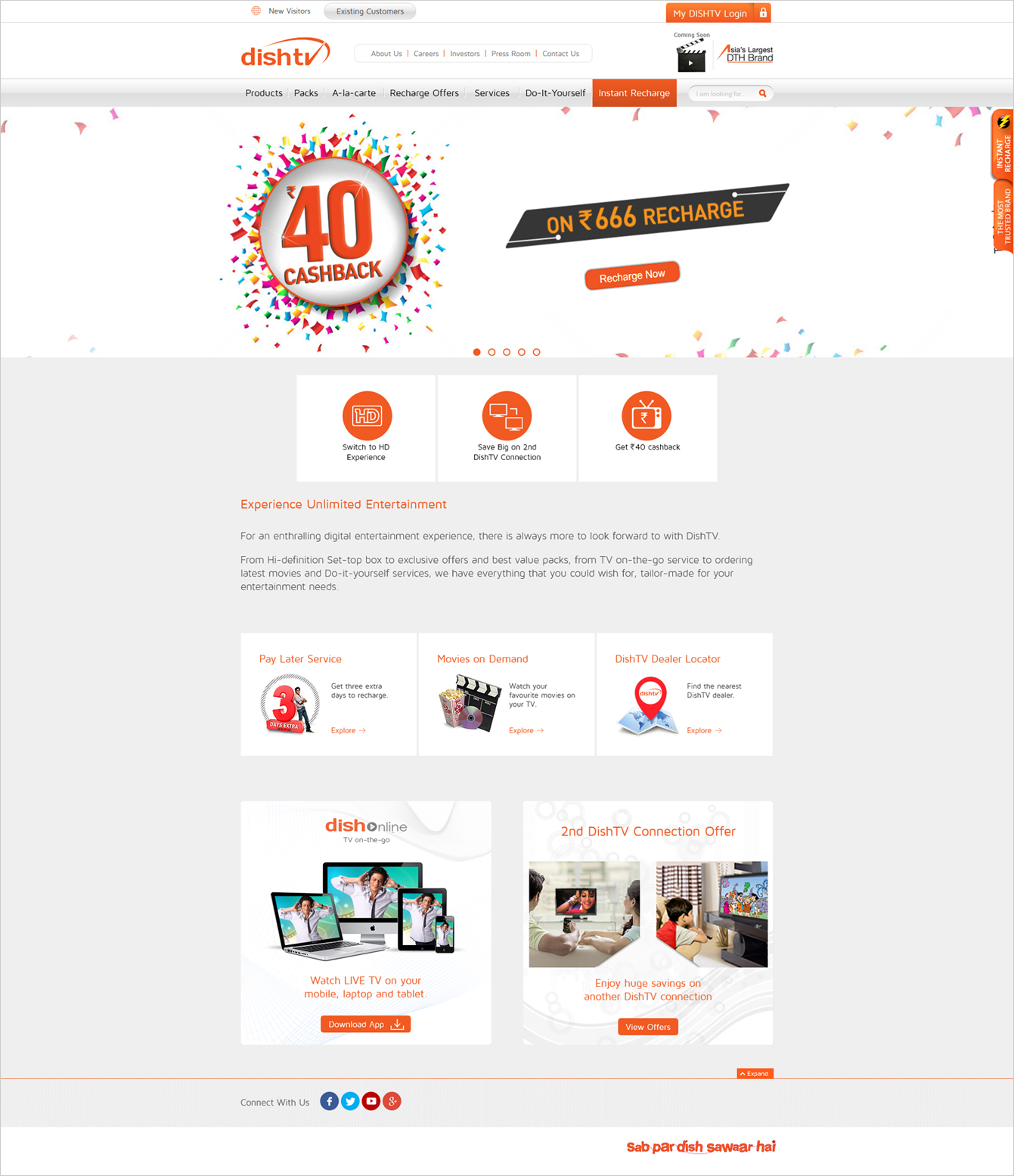
Identifying that there existed two different segments of consumers, that is, those who are already part of the DishTV family and those who are new to DishTV, brought a very unique design insight to us. It led us to create two different journeys for these unique set of users, where in an existing consumer’s journey was charted to be functionally and aesthetically different from that of the new user.

The Existing User

The existing user journey involves a pre-set order of channel options, in accordance to the user’s liking and his preferred combination of channels available to him. This online journey does not bank upon cognition mechanisms, and the user can quickly move ahead with channel pack selection to checkout.

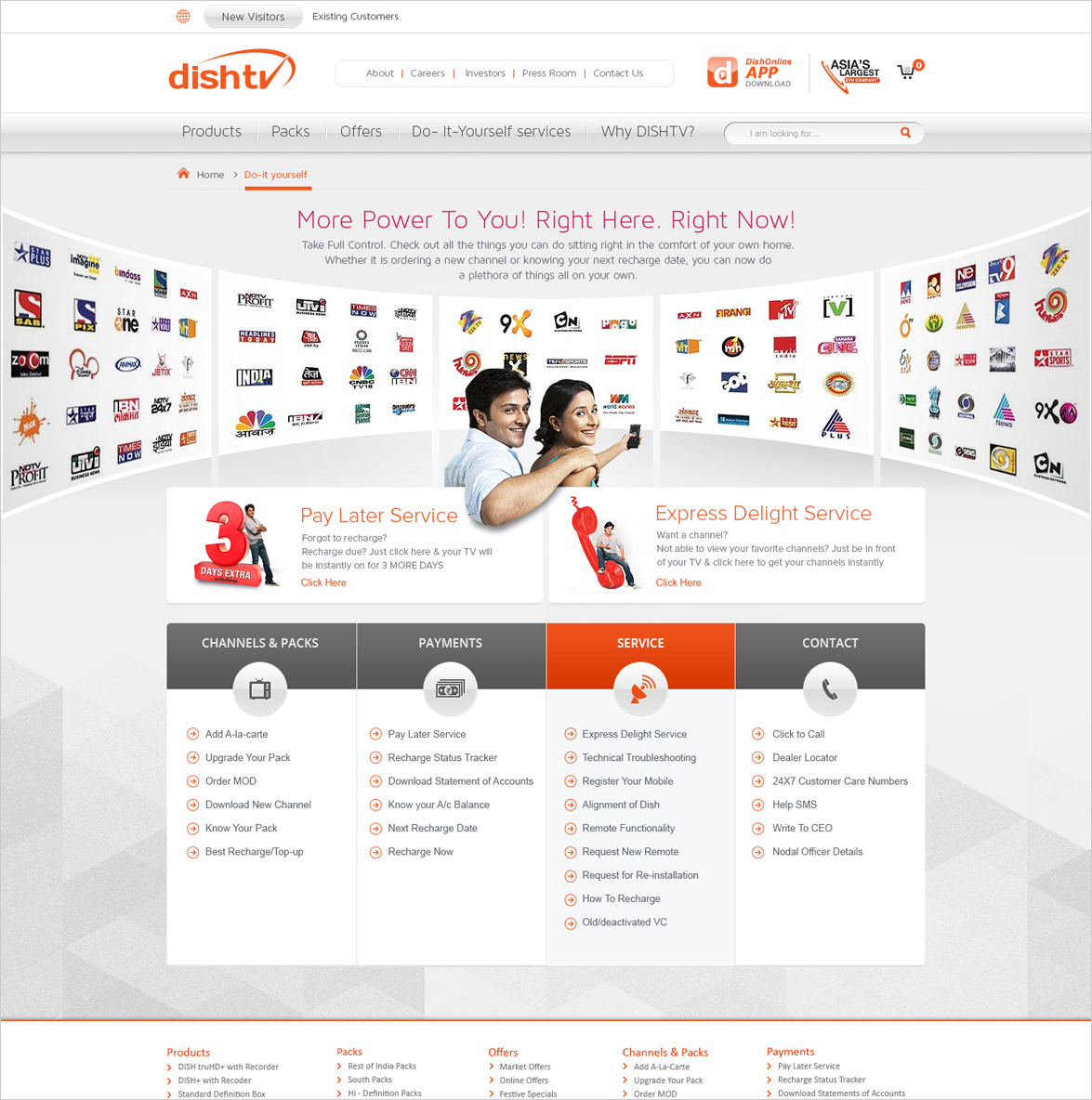
Also, for existing users, we created a very dynamic dashboard to enable a self-service. The dashboard can be customized by the user based on his/her preferences, making day to day transactions a breeze and also reducing the need to reach out to the customer care team, as was the case earlier.

New User

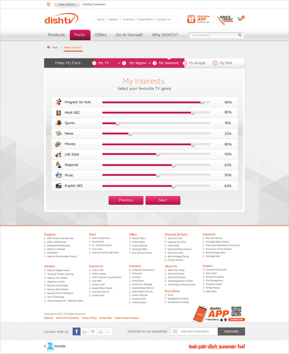
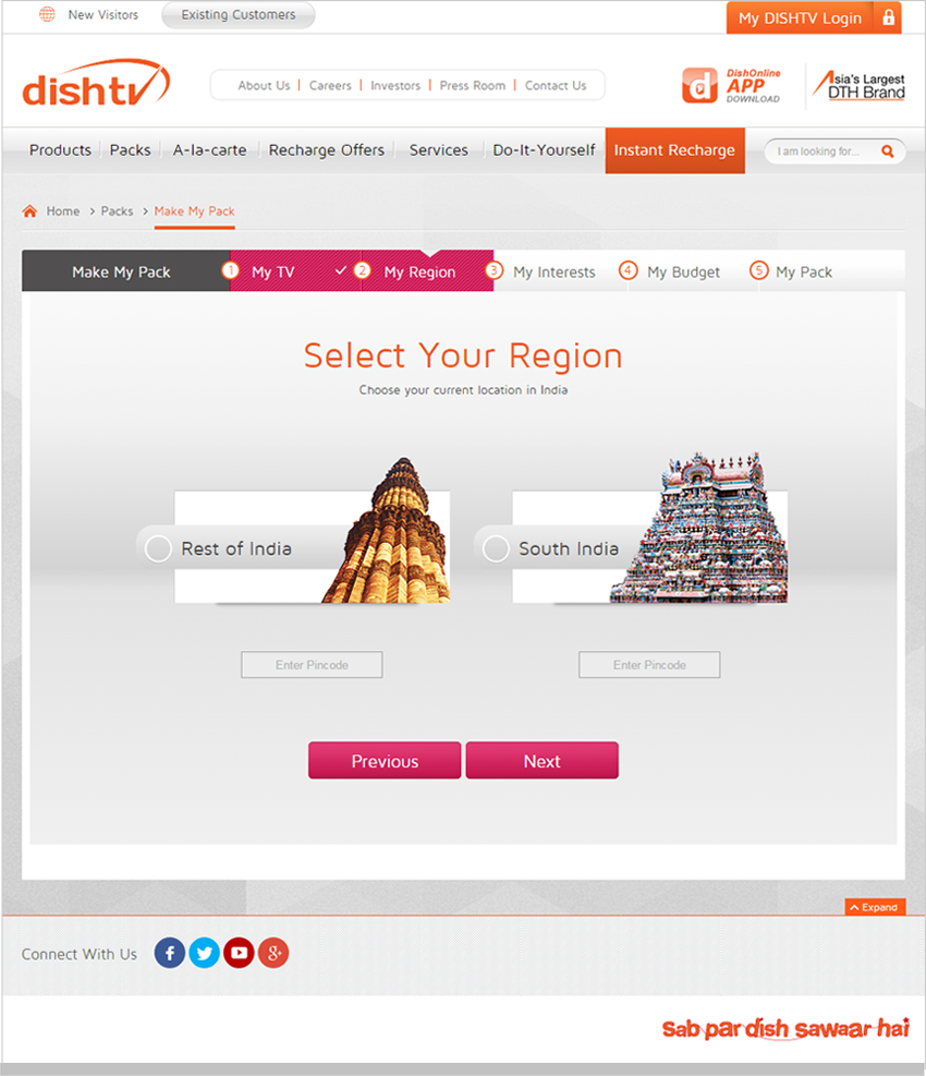
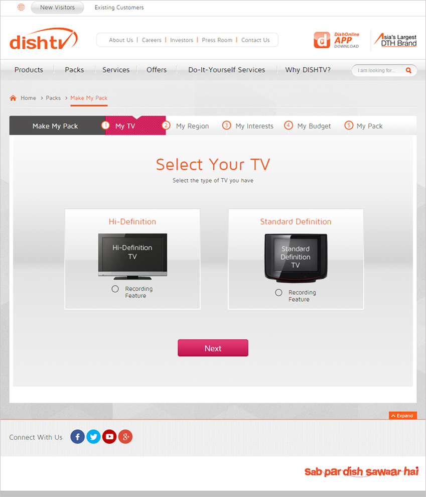
New users have a different interface which provides him with multiple options in creating a channel combo, which can be saved. Guidance is another factor that we worked upon for the new user’s section. We understood that certain things, new users cannot decide for themselves like which set-top-box may be right for them or which channels/channel packs,are best suited as per their entertainment needs . A guided journey is paved for them to understand and analyze their requirement so they end up purchasing the right thing.

This unique journey established the brand’s essence of giving personalized and quality service for an entertainment centric crowd.

Fluid Navigation and Enhanced UI

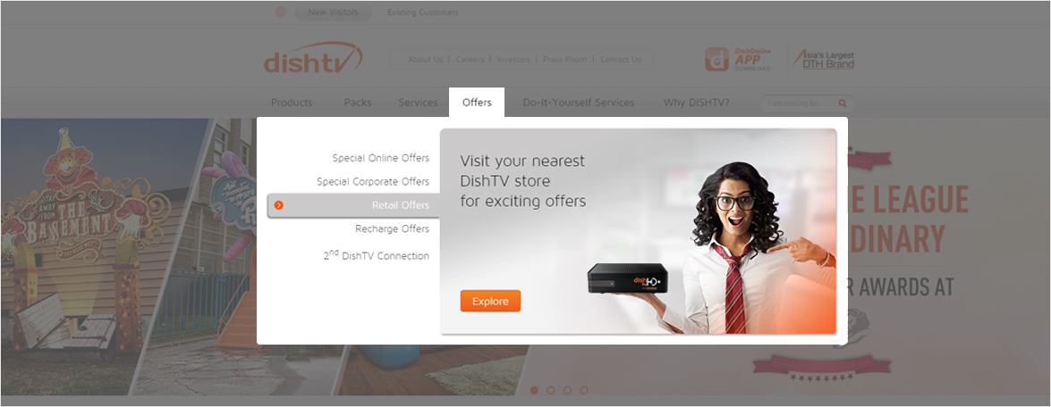
The fluidity and the UI of the website, emerged from the quintessential nature of the then Tagline ‘Wish karo, Dish Karo’. We wanted to attribute an extended design metaphor of how easy it would be to acquire something you want on the website. The architecture of the website, provides full flexibility to the customer to jump to any section any time and no segment is more than three clicks away in the website.

Connect and Content

Our content direction on this project was focused upon keeping the data fresh, focused and relevant. A brand as big as DishTV (who use Shahrukh Khan as their brand ambassador) has always been updated to offer the ideal experience to the customers. We made a design and content structure that was constantly updated with fresh, relevant content.

With banners and ads changing in accordance with events that encompassed the entertainment world, the content is made to facilitate a consumer’s journey of offline entertainment, relevant online.

We are also planning a full social media integration for the website so there is never a platform that a consumer cannot use to communicate with the brand and help keep the subject matter relevant.

wwwant to get in touch?


Sales Enquiry

Alternative No.

+91 98 9923 5987